↓ Scroll down or click for more images
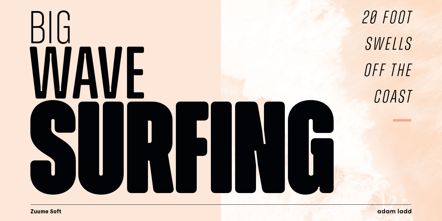
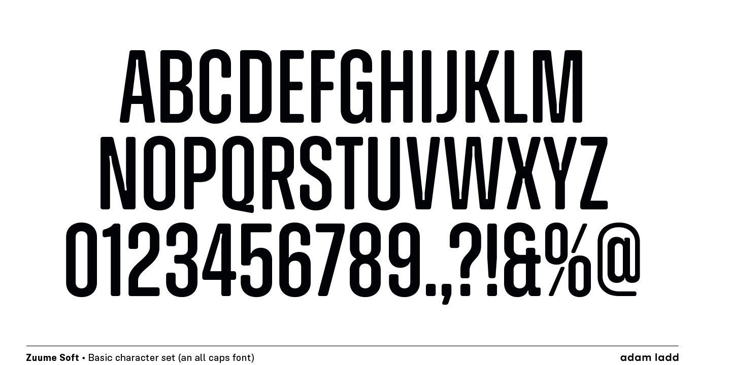
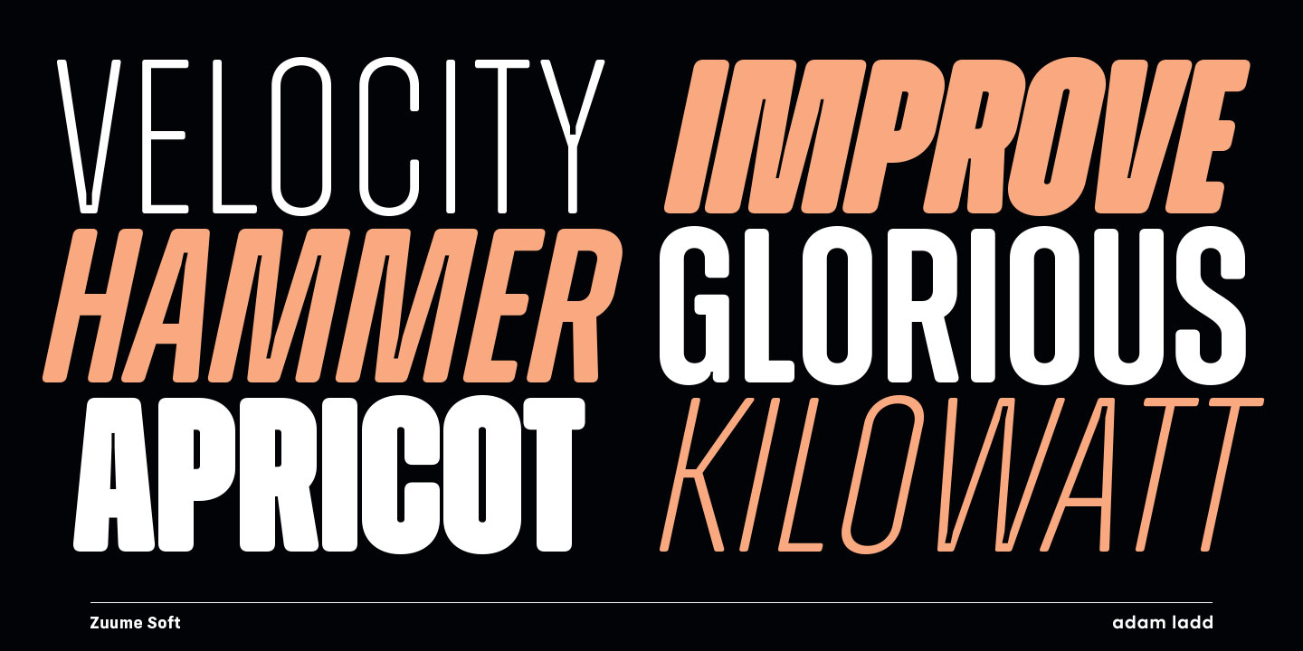
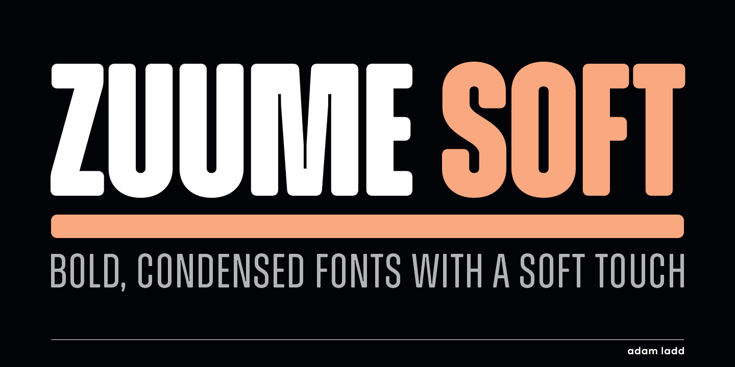
Zuume Soft is a charismatically dichotomous
condensed sans. Sister to Zuume, it is
staunchly upright in its stance, but round
where corners should exist. The tone of voice
all depends upon the project. This family will
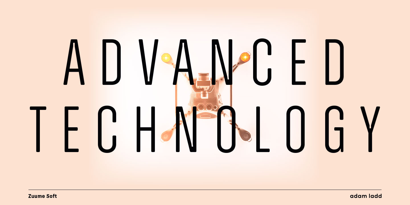
enliven magazine headlines, media brands,
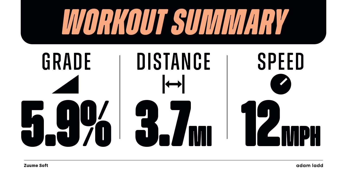
fitness packaging, kidlit book covers,
in-your-face sports entertainment, festival
posters, or anywhere else designers want to
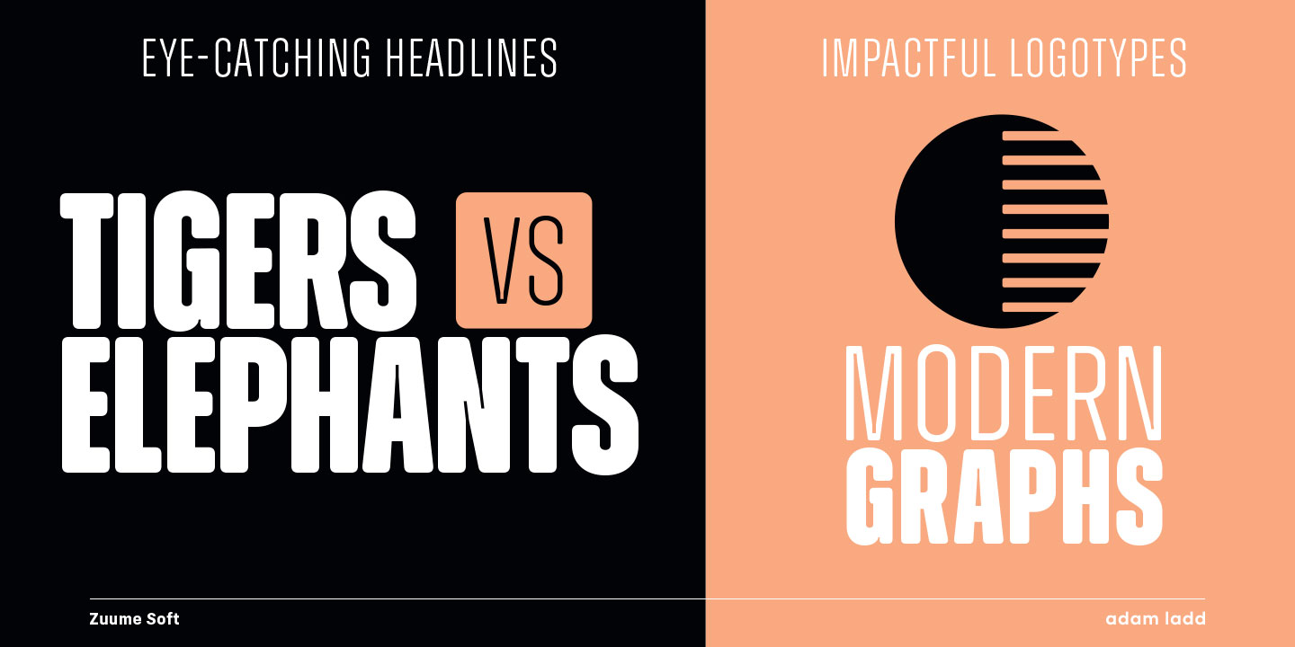
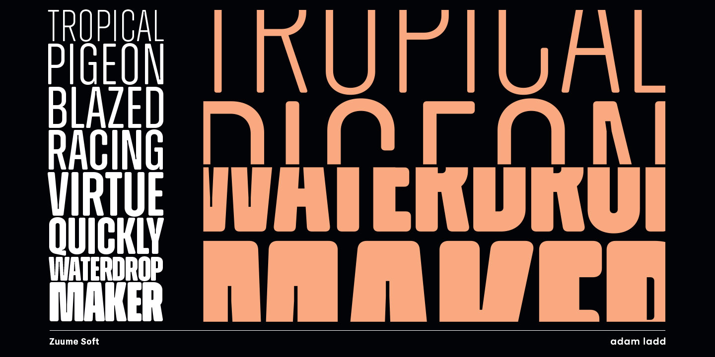
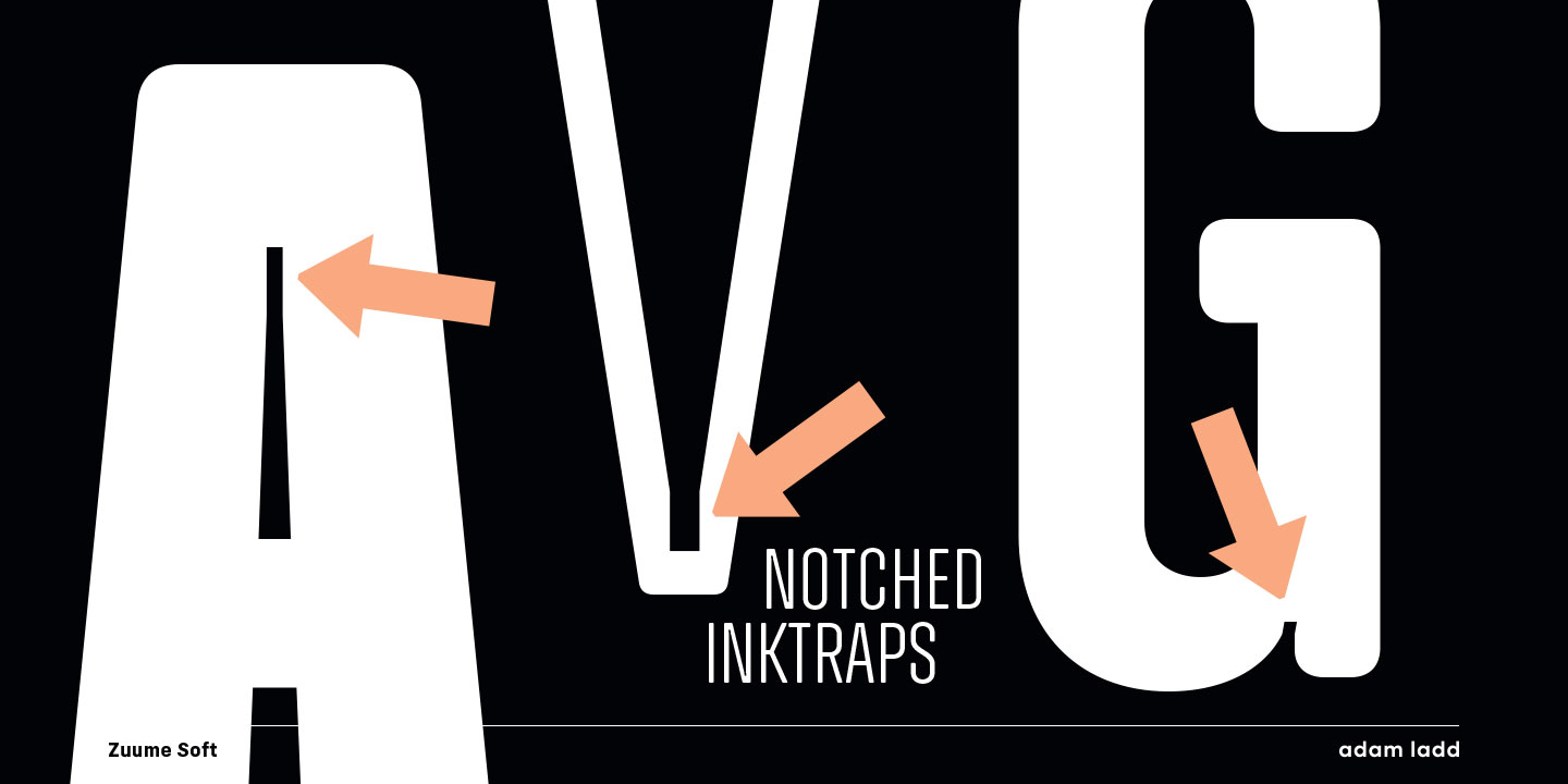
create playful drama. The notched ink traps
and weight range deliver a more delicate feel
in the lighter weights, while the bold,
blacker weights can be tightly spaced and
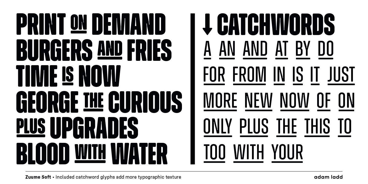
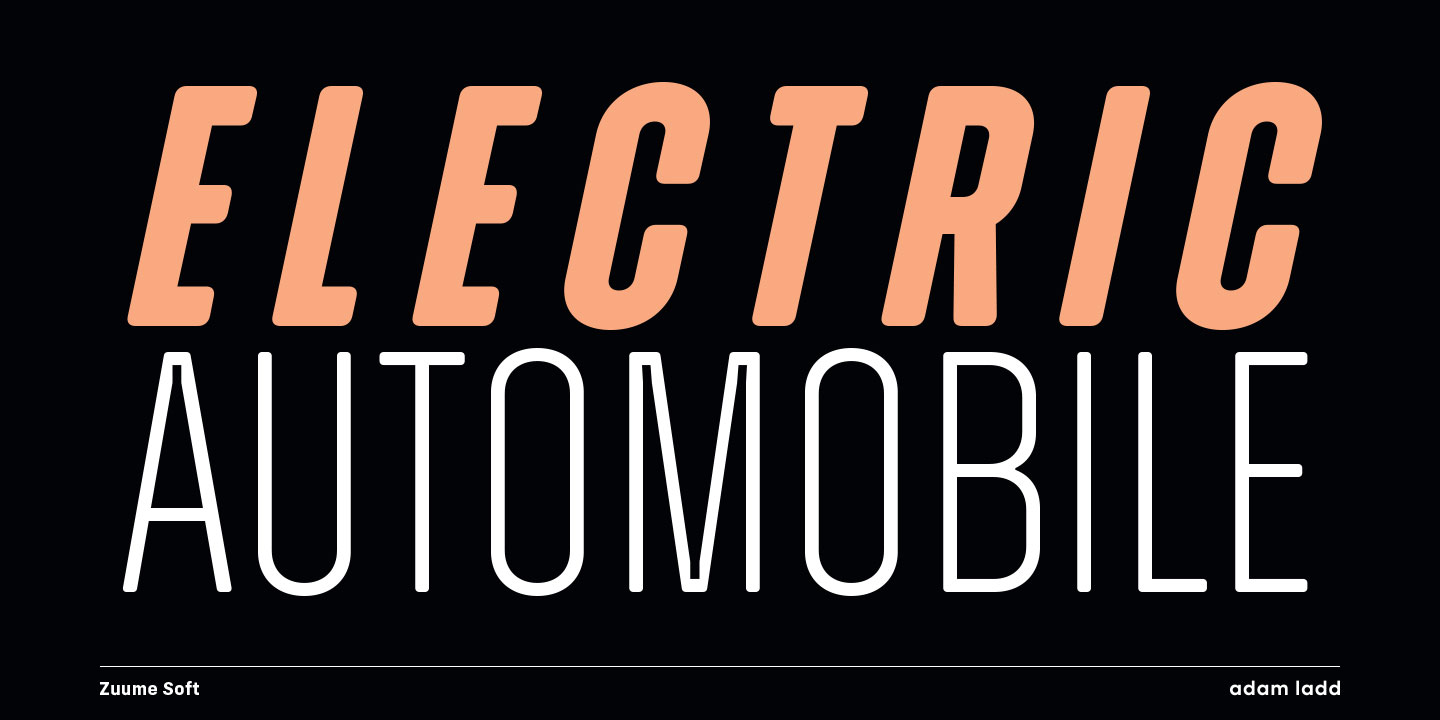
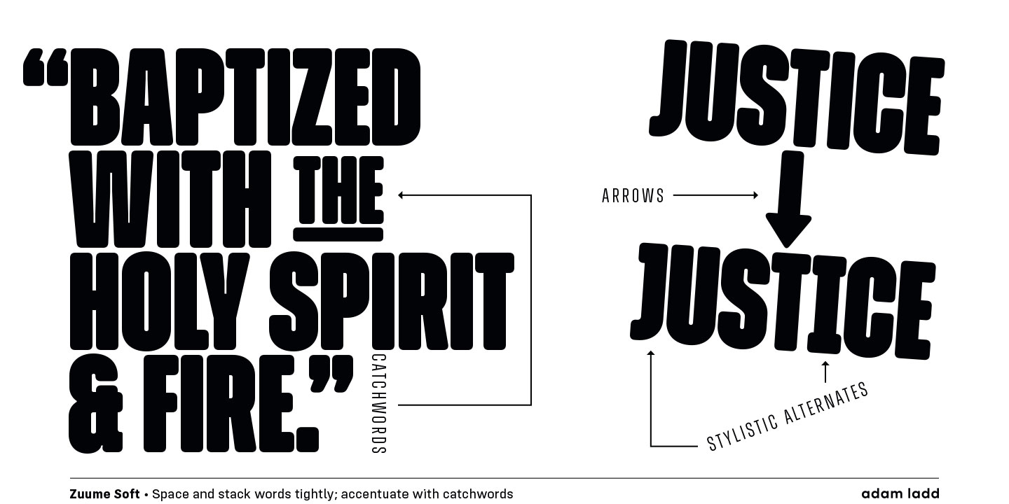
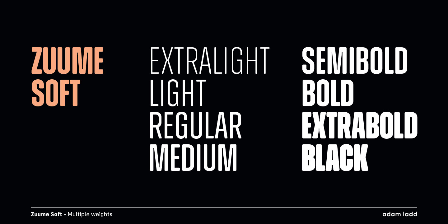
stacked for a visual punch. Zuume Soft has
eight weights, italics, catchwords, and
arrows. Using the compelling and versatile
Zuume Soft in your typography will have a
lasting impact.