↓ Scroll down or click for more images
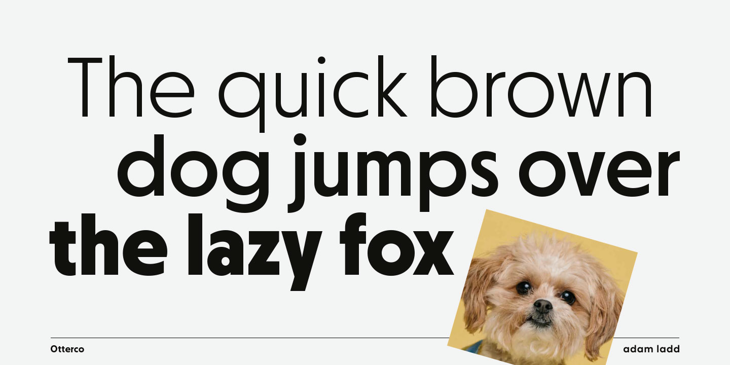
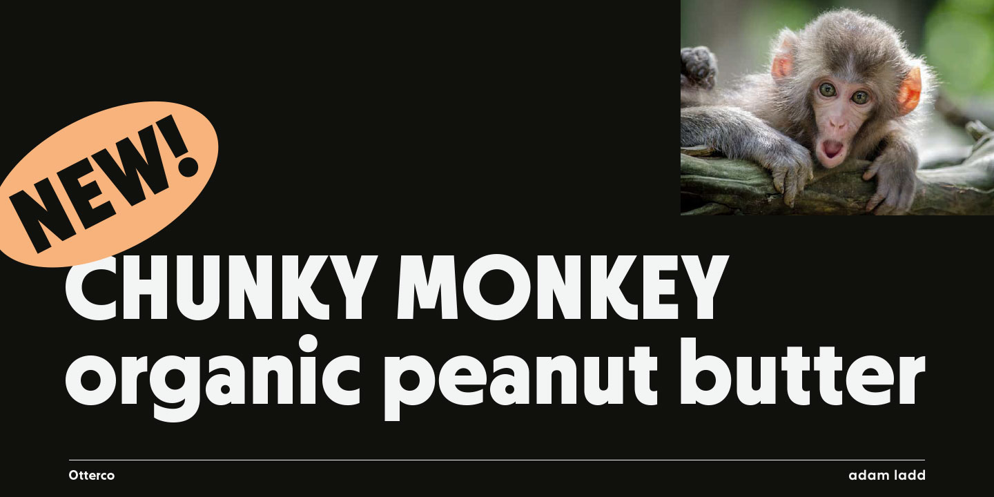
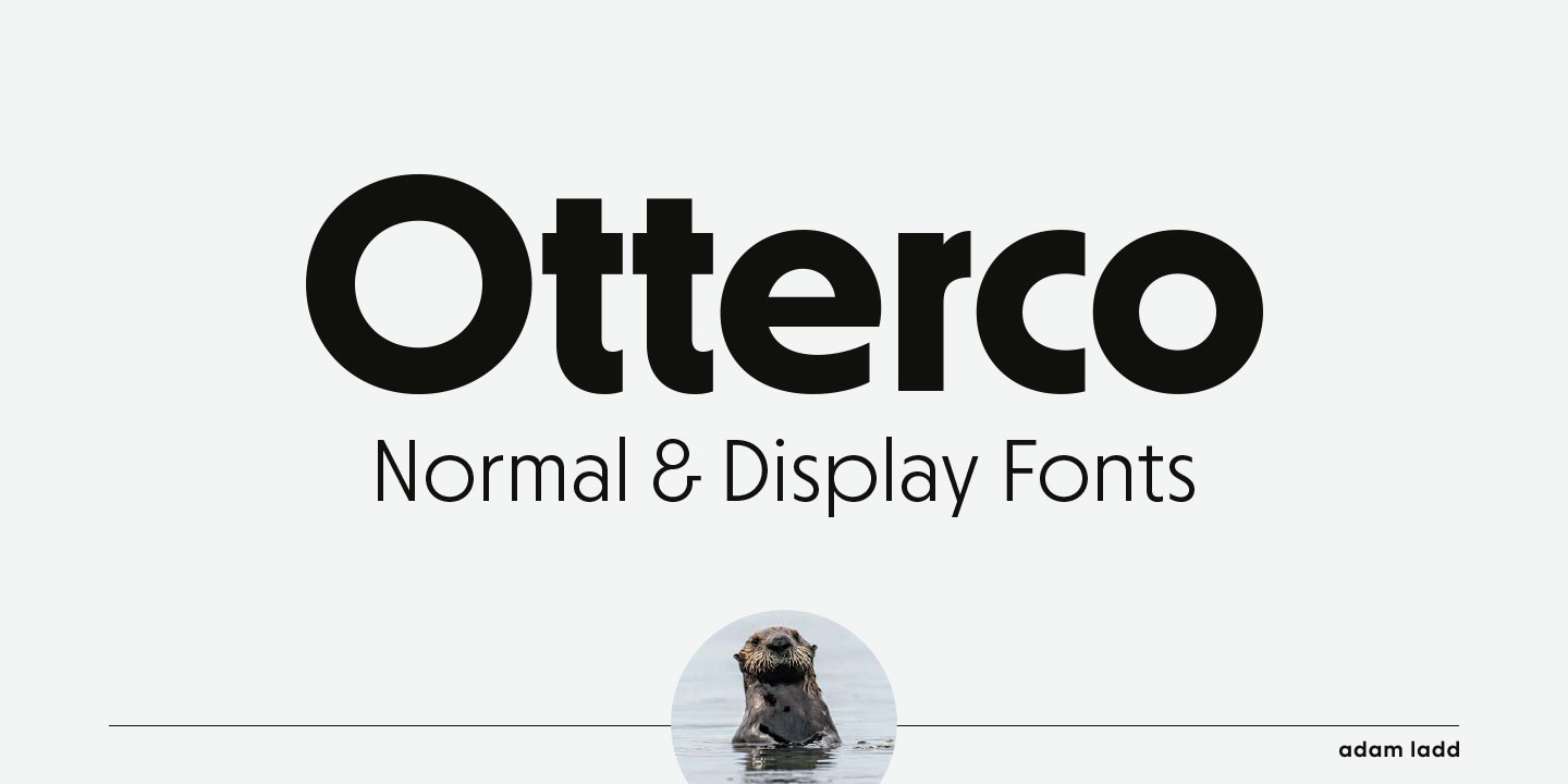
Otterco is a theatrical geometric sans in the
spirit of the early 20th century. The design
leans toward the subtly retro and starkly
modern qualities that give it drama and
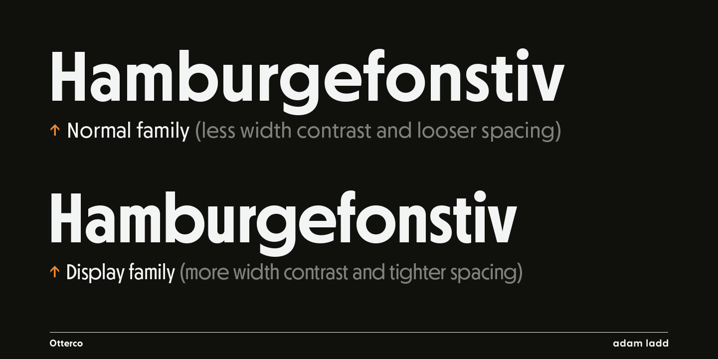
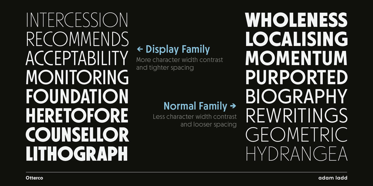
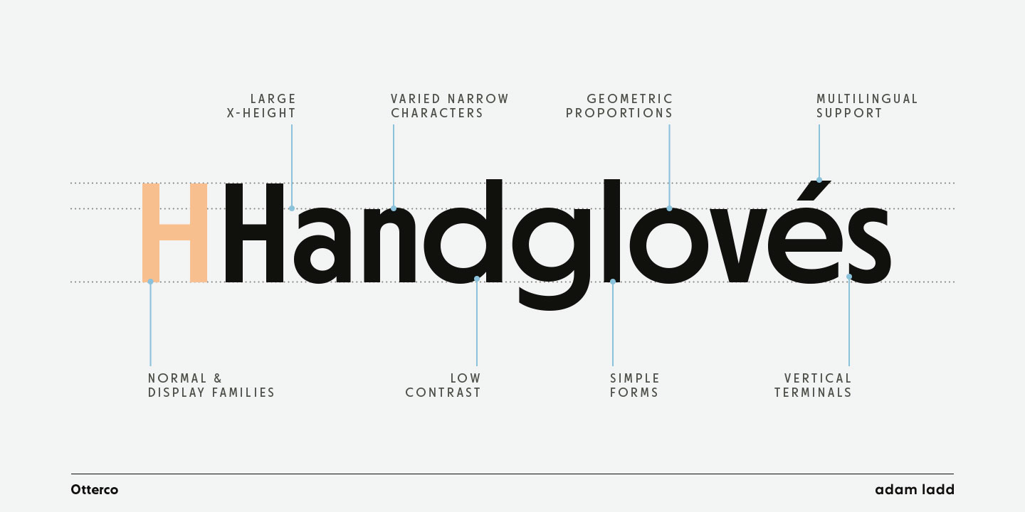
panache. Available in both Display and Normal
families, each family lends itself to a
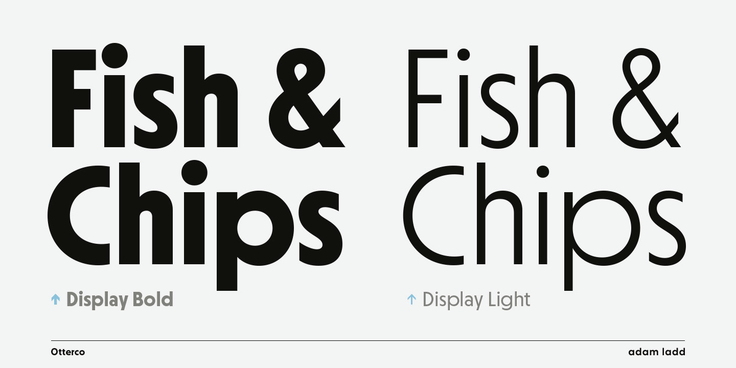
different tone of voice. Otterco Display has a
nuanced rhythm created by varied round and
narrow characters combined with tighter
spacing—useful for fierce, attention-getting
headlines. While Otterco Normal incorporates
less width contrast, large x-height, and
looser spacing—perfect for both book captions
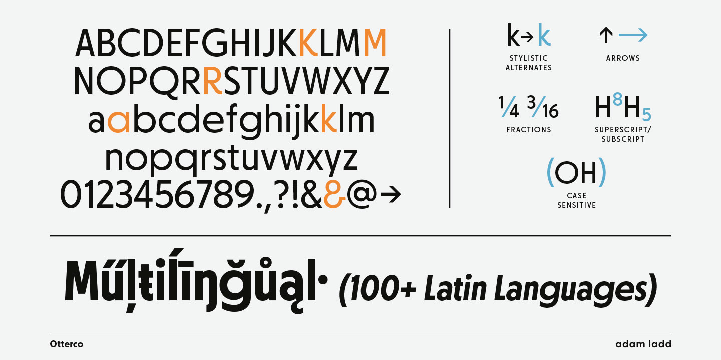
and large billboards. With 32 total fonts in
thin through extra bold weights, including
italics, Otterco will add finesse and
individuality to your project.